
Wendy Westlake: The Bones
Inside the Minnesota studio of a painter who believes that structure is not the opposite of freedom — it is the source of it.
There is a word that runs beneath everything Wendy Westlake says about her paintings. Beneath the color choices, the shape decisions, the layered washes and the palette questions. Bones.
She means it precisely. Strip a painting back to greyscale — drain every drop of blue and burnt sienna and ochre — and what remains is the skeleton. Light, dark, medium ground. The proportions between them. The way shapes interlock rather than float. If those things are right, she says, the brush can go anywhere. If they are wrong, no amount of beautiful color will save you.
It is a counterintuitive idea. Most painters, looking at Wendy’s work for the first time, assume the color came first. The palettes are so particular — those cool blues that collectors keep asking for, laid against warm siennas, anchored by the deep authority of black arriving late. The shapes feel organic and discovered, as if they grew rather than were placed. The work has the quality of looseness, of decisions made in the moment.
Except they weren’t. Or not in the way it looks.
“If you have good bones and proportion, you can go anywhere with color.”
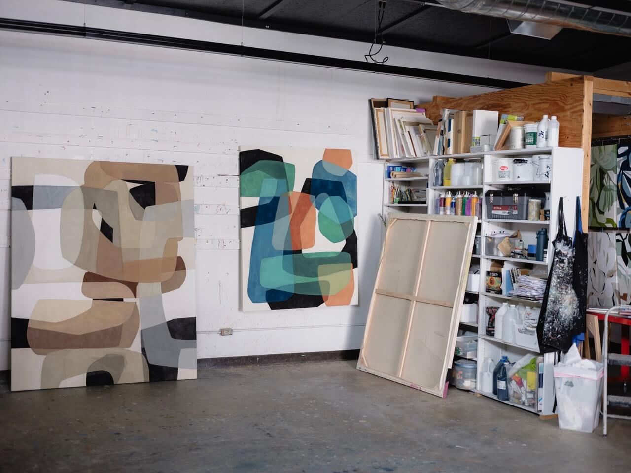
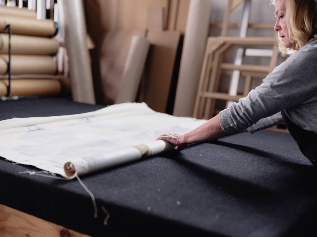
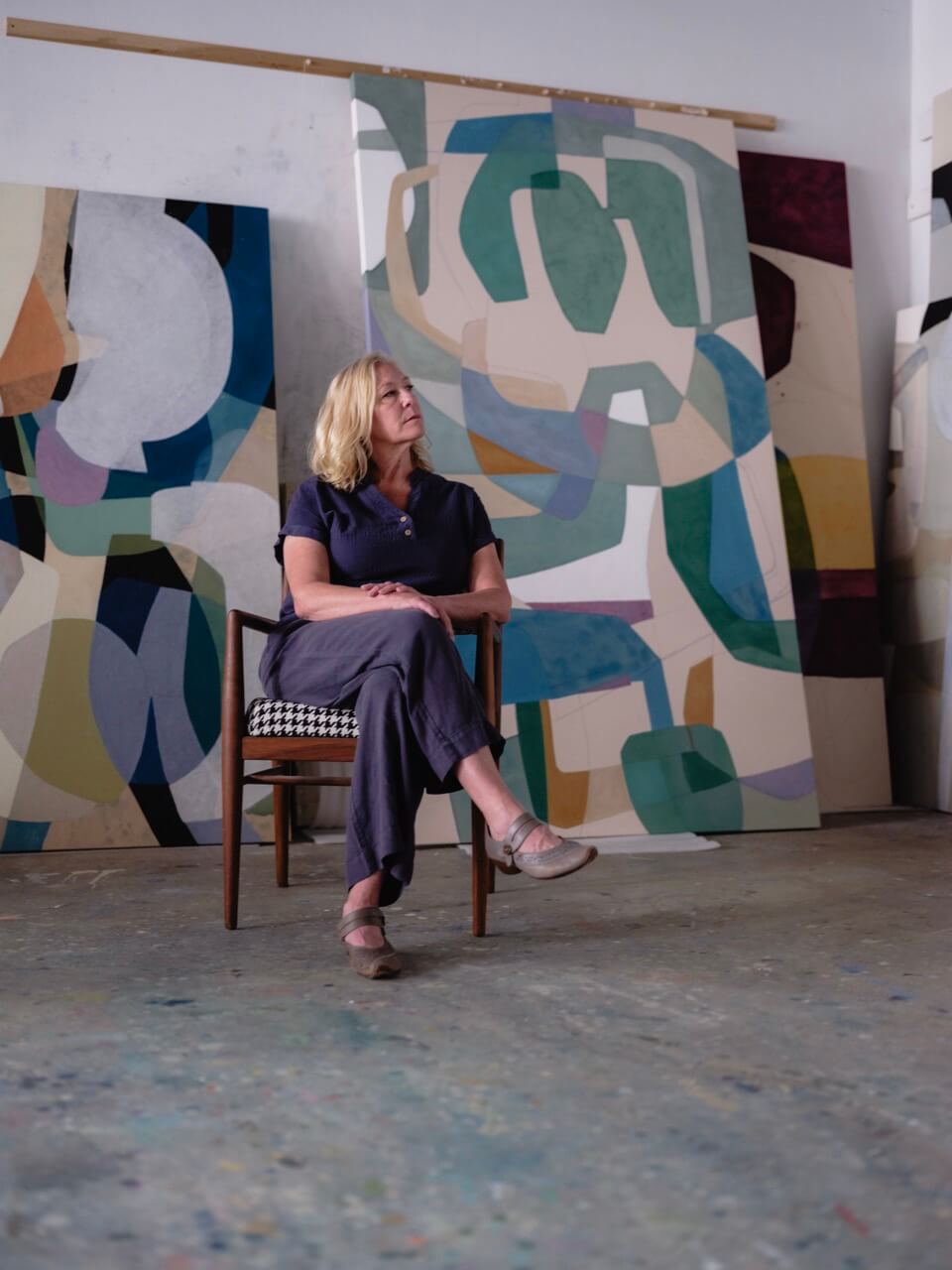
Wendy’s studio occupies a former auto parts store on a quiet street in a small Minnesota town. Her husband helped renovate it. There is a lounge area near the front, a long painting table in the centre, canvases stacked against every wall — some finished, some mid-process, some with whole areas painted out and started again. A hanging rack runs the length of one side. The stretcher bars leaning in the corner are taller than she is.
She bought the space with insurance money after a gallery she owned burned down. Eight months of work, gone. The payout became the studio, and the studio made everything else possible. It is the kind of accident she would recognise from the paintings.
The foundation, though, is not accidental at all. It came from watercolor.
Wendy spent years as a young mother painting watercolor, joining the Minnesota Watercolor Society, eventually becoming its president. She took workshops constantly — not for the painting time, but for what the workshops taught her to see. And what watercolor teaches, she says, is that you cannot fix what you did not plan. In the disciplines that mattered most — the shows where a judge would walk the room with a light, checking that no painter had used white — the design had to be solved before the first wash went down. Saved whites. Planned lights. The bones, decided in advance.
“If you want white in a watercolor,” she says, “you have to have that plan from the start.”
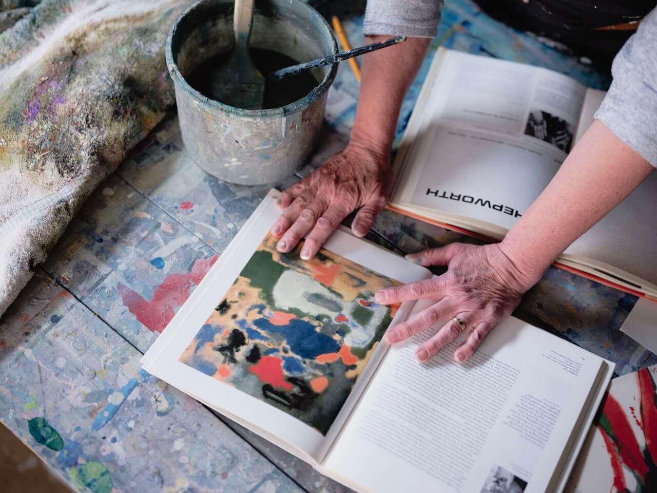
She carried it all into acrylic. The habit of asking, first, where the lights will go. The instinct to solve the value structure before reaching for a color. The training she received — from teachers who were, by her description, occasionally brutal about it — that the first composition you sketch will almost always be your least interesting one. So you do it again. And again. Until something genuinely unexpected happens.
“Your first pass at it is going to be your least interesting one. Almost always.”
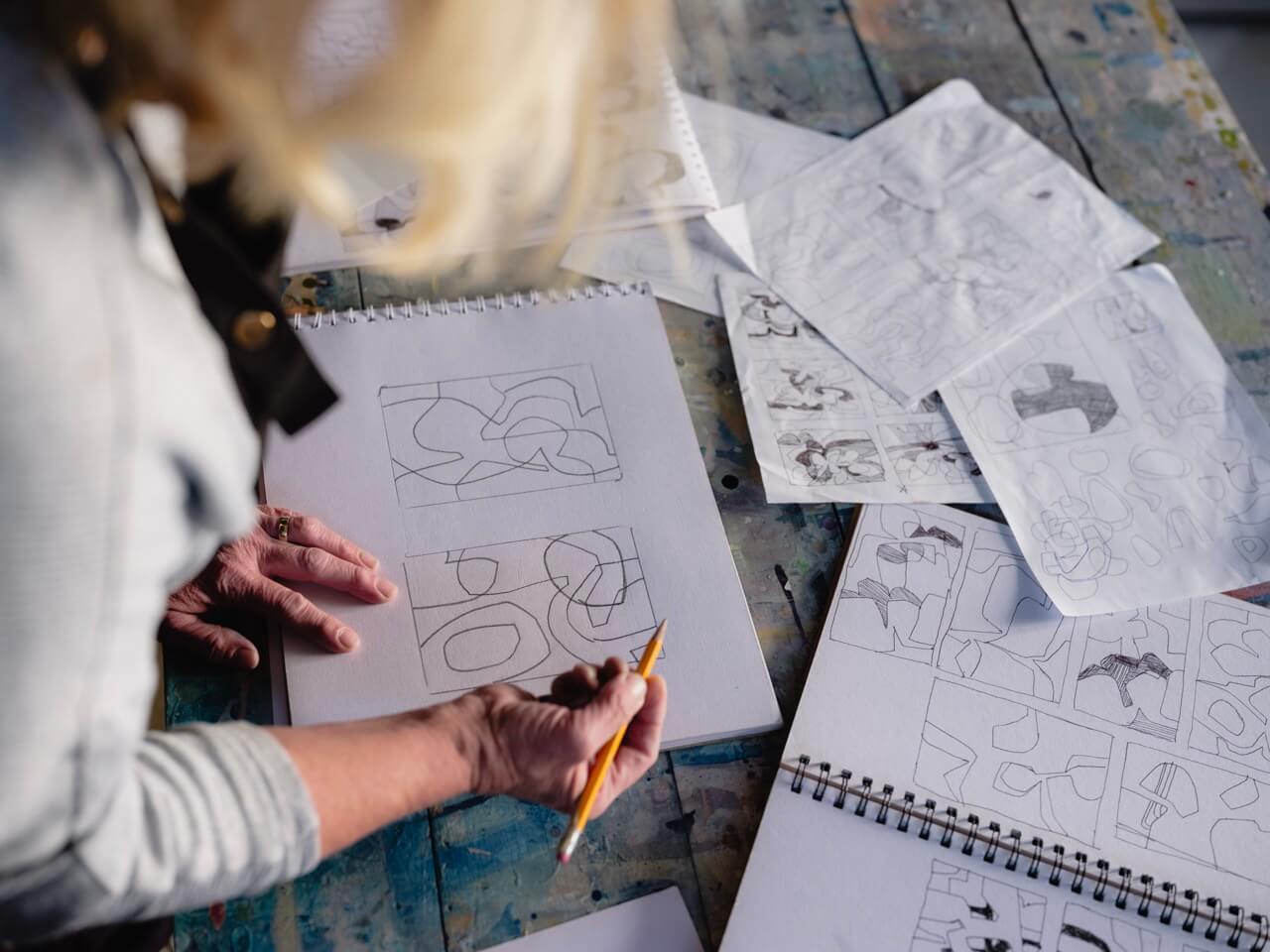
She talks about a three-day workshop where the instructor refused to let anyone open their paints until the design work was done. Three days of thumbnails. Three days of redistributing shapes, questioning corners, asking whether the eye had somewhere to go. The students, weekend painters who had come to paint, were furious. By the end, they understood.
“Which part of your canvas is not designed?” was the question her teacher asked. It stayed with her. Every inch, Wendy believes, is a decision — including the negative space. If you left it blank, that had to be a choice. Not an oversight. Not a patch you just didn’t get to.
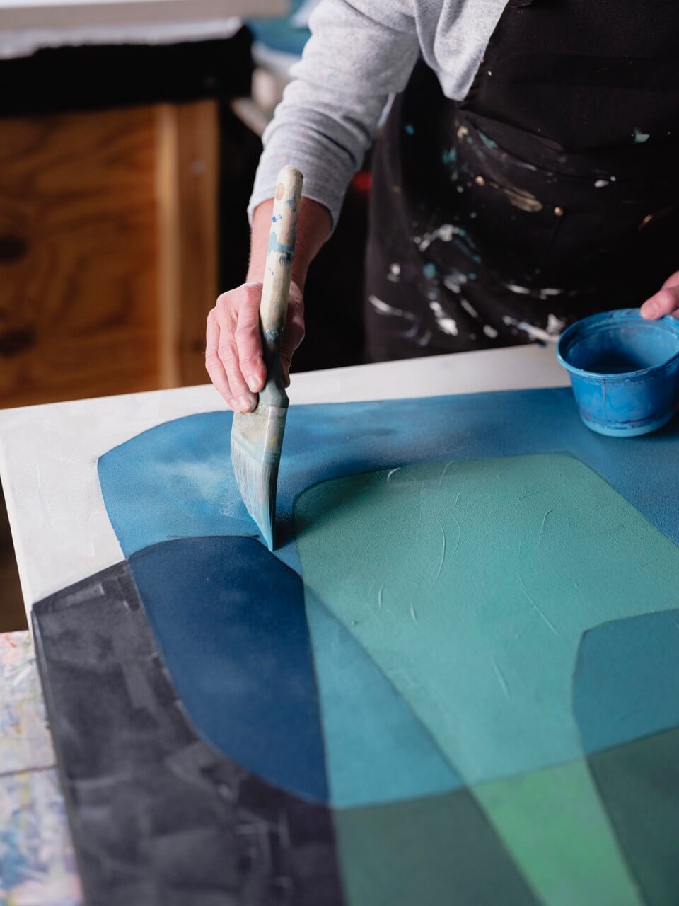
The shapes come first. Always. Wendy generates them on the computer — Adobe Elements, layers of color, shapes on their own planes that she can rotate and scale and push against each other in seconds. But she can also trace everyday objects onto semi-transparent paper, stack the layers, and find compositions that no one would have drawn freehand. A pair of scissors over a cup. A pair of glasses turned sideways. The shapes that emerge are not hers, exactly, and not the objects’ — they belong to the overlap.
What makes a shape interesting, she says, is whether it could be folded in half and mirror itself. If it can, it’s boring. Symmetry is the default, the easiest answer the brain reaches for. The work is to resist it. To push one edge further than the other. To make the corner exits unequal. To ensure that the shapes interlock rather than sit beside each other — that if you made the painting three-dimensional and tried to lift it, the pieces would hold together.
“A circle,” she says, “is the most powerful shape you can make. Your eye will zero in on it immediately. I try never to put a perfect circle in any of my work. I don’t want one thing to dominate that much.”
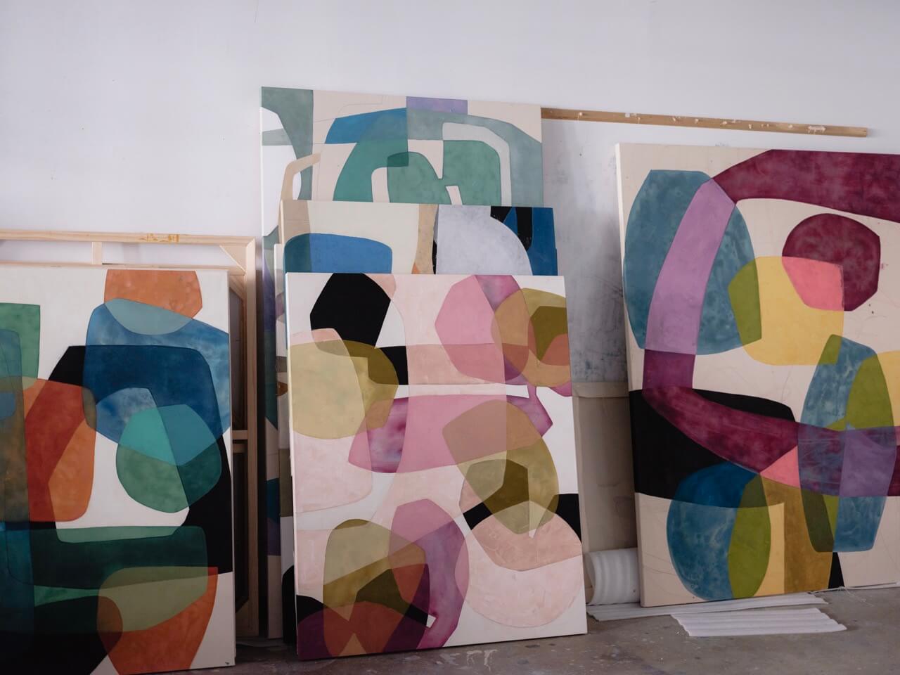
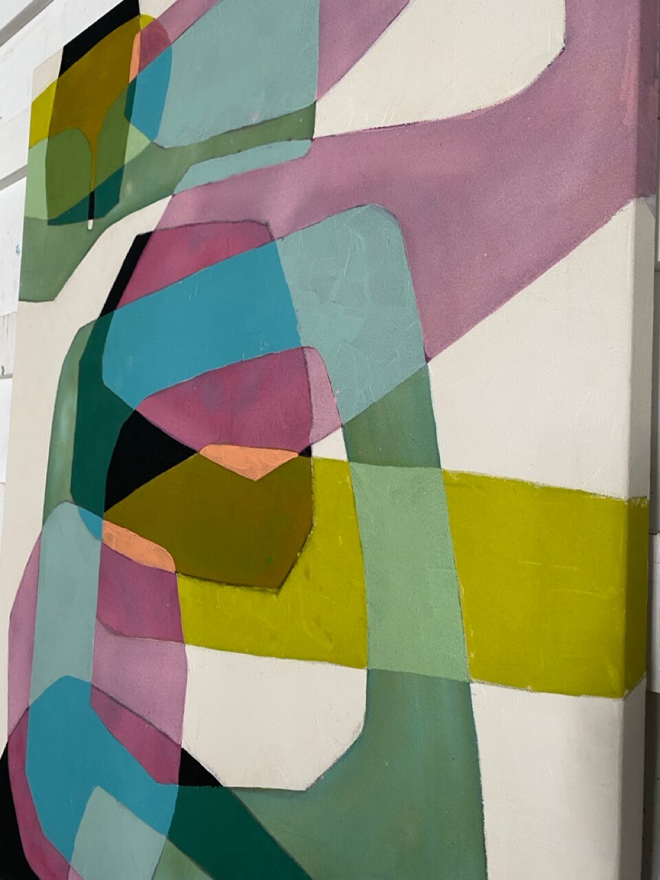
Harmony is the word she comes back to. Not in the sense of pleasantness or decoration, but in the structural sense — that everything in the painting is in a considered relationship with everything else. The value distribution. The shape interactions. The color proportions. Seventy percent of one tone, twenty percent of another, ten percent of the third. Not a rule to follow mechanically, but a question to keep asking. Is this resolved? Is there something I left undesigned?
“I want to do something I personally have not done before. I don’t think I’m having ginormous breakthroughs. But there are small ones. And it’s like — oh, that was interesting.”
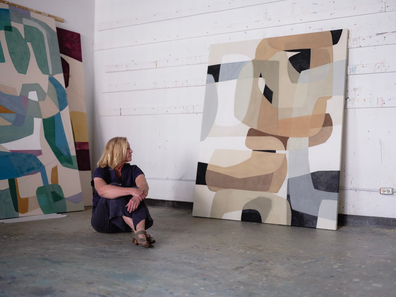
Color comes later. Not as an afterthought, but as a consequence. Once the design is resolved — once the bones are right, the value structure planned, the shapes interlocked — the color can do almost anything. The same composition with a different palette becomes a different painting. A hundred paintings, she says, could be made from the same design.
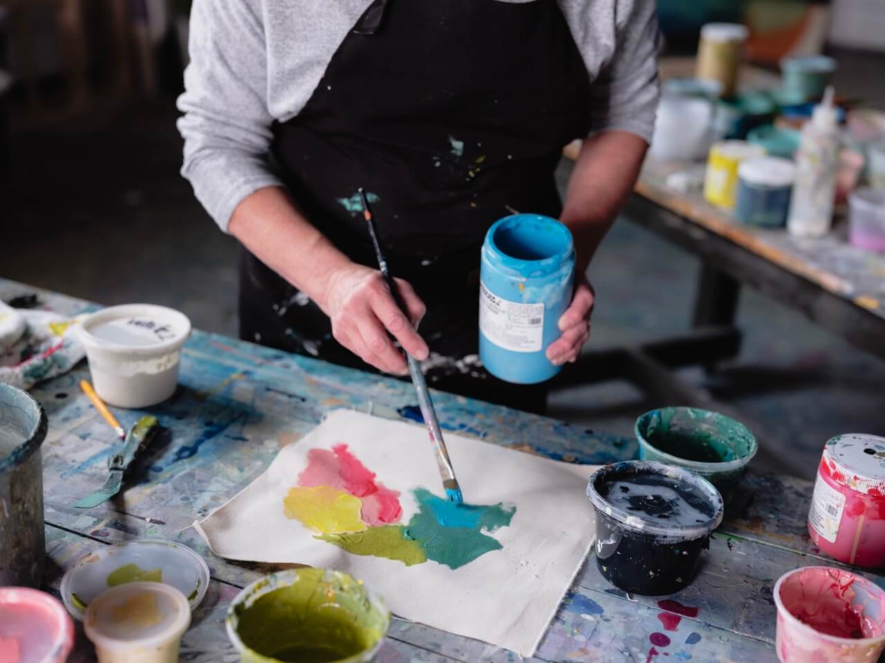
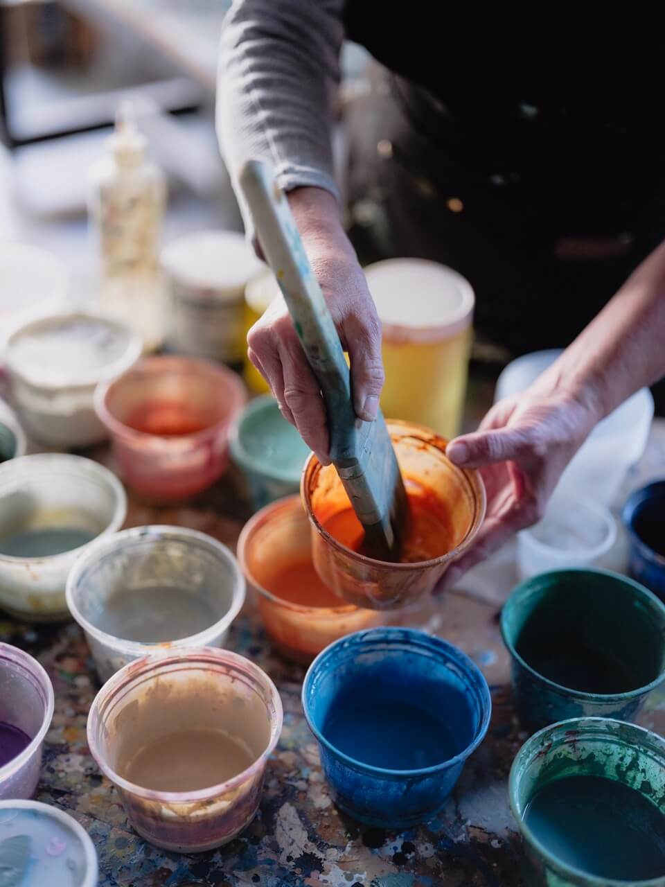
She finds her palettes everywhere. A Kleenex box. A Pantone chip caught out of the corner of her eye. A combination she’s been meaning to try for months. She holds them loosely at first — two colors and black and white, mixed into tones, the limited palette that she says changed her life when she discovered it. Then she asks the only question she ever really asks: What if?
What if this burnt sienna bled into the blue? What if this corner stayed almost empty? What if black arrived last, when the composition was nearly resolved, and the painting suddenly came to life?
“I love painting because I get to ask myself: what if? What if I put that with that? I don’t know. And then you find out.”
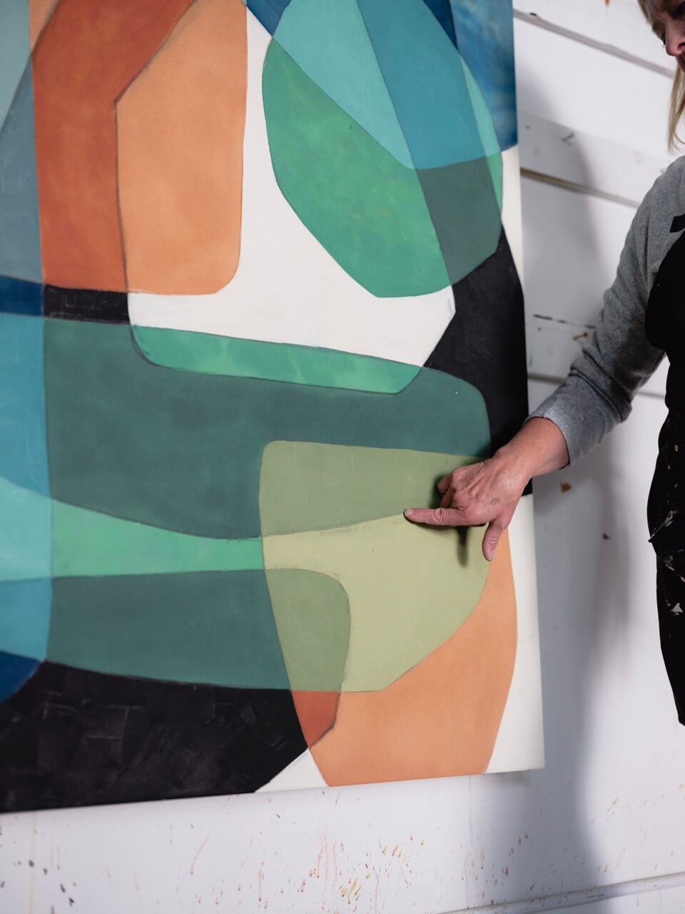
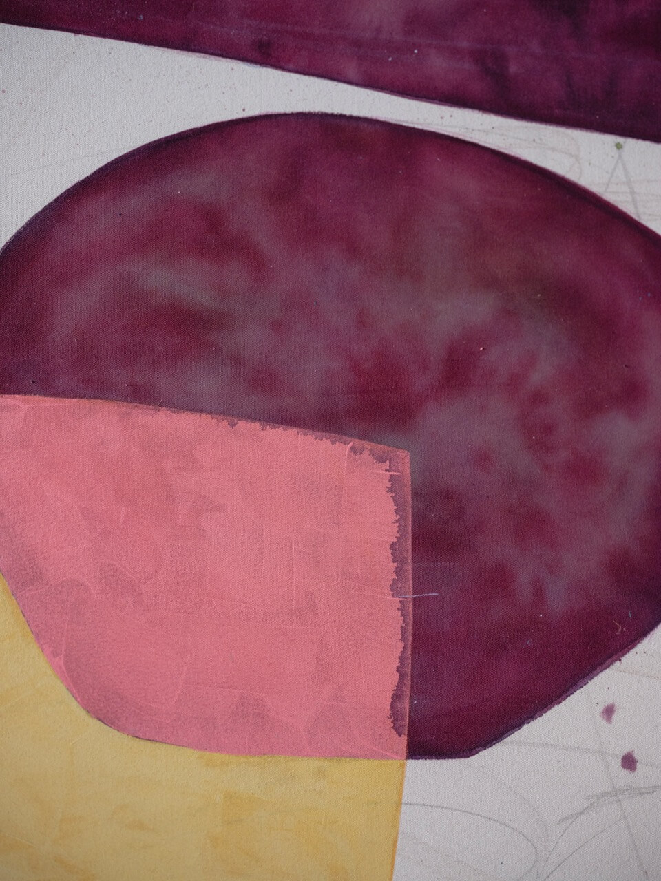
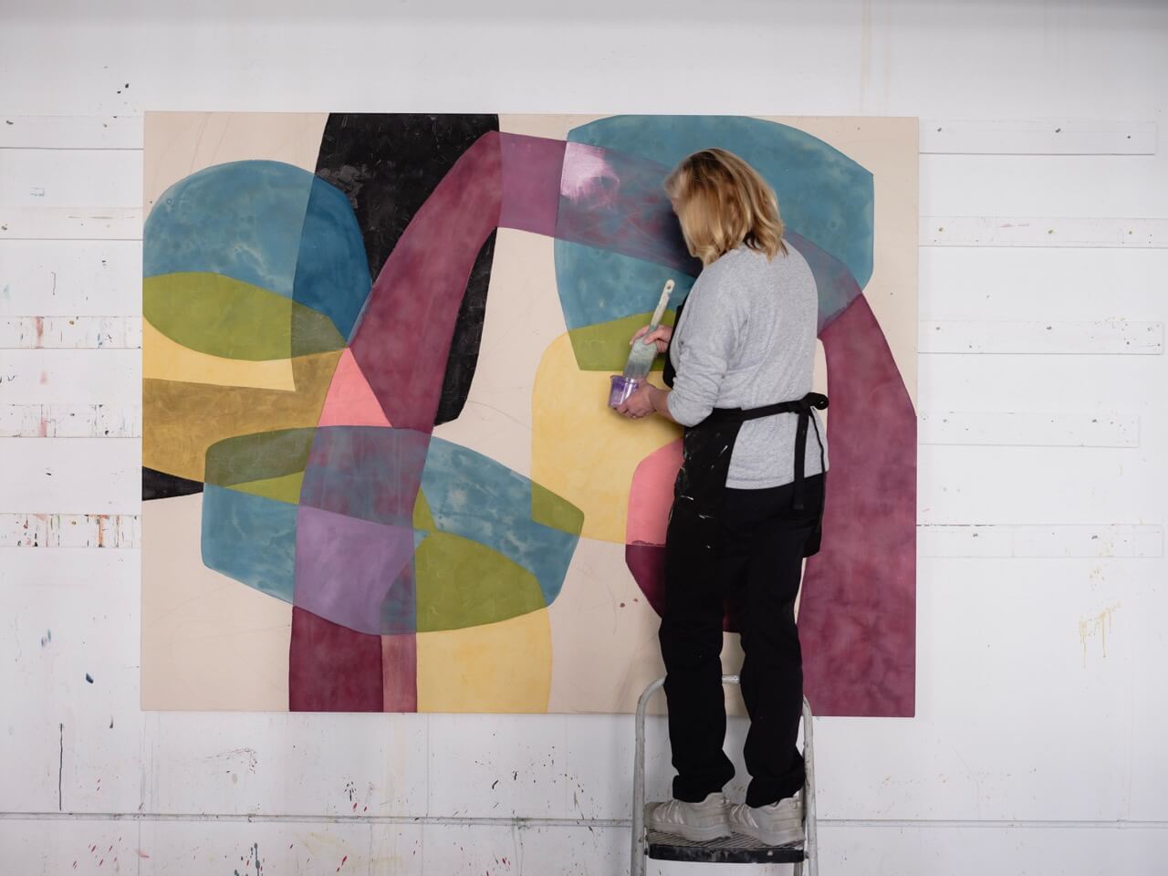
Because that is what happens. She describes it plainly: you work through the wash layers, the mid-tones, the careful opaque shapes, and the painting looks uncertain. Then the black goes in, then the white, and something arrives. Not from the color. From the bones underneath it, finally visible.
She talks about standing back. Fifty feet, if the studio allows it. Asking whether the painting holds at a distance before you commit to anything up close. Whether it would catch your eye from a gallery window. Whether you’d park the car.
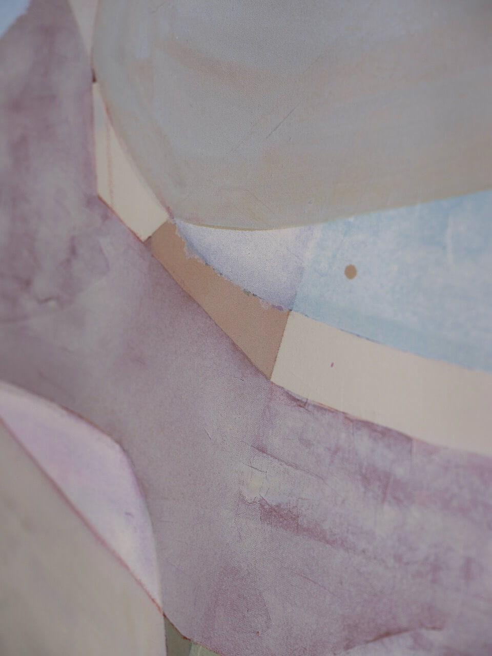
And then, up close, whether it still holds. Whether the texture is there — those subtle layers where the pigment has sunk into the unprimed canvas, where the watery washes dried darker than expected, where the charging created something neither wash could have made alone. Whether the painting earns the looking.
She is particular about what she has not done as much as what she has. No varnish, for a long time. No gesso. Raw canvas, which drinks the first layers differently, which gives the blues their authority and makes the siennas bleed regardless. She has learned to work with these behaviours rather than against them. To embrace what the paint does and correct what it does too much of.
There is, she acknowledges, nothing romantic about this part of the process. The assessing. The glazing over of a color that is fighting too hard. The decision to paint a shape out entirely and start again. But it is, she thinks, where the skill actually lives. Not in the inspiration. Not even in the technique. In the ability to look honestly at the work and ask — without sentimentality, without defensiveness — what is not designed here. What have I left undecided.
“Every inch of your canvas is designed. If there’s nothing in it, that’s fine. But then you should have made that decision.”
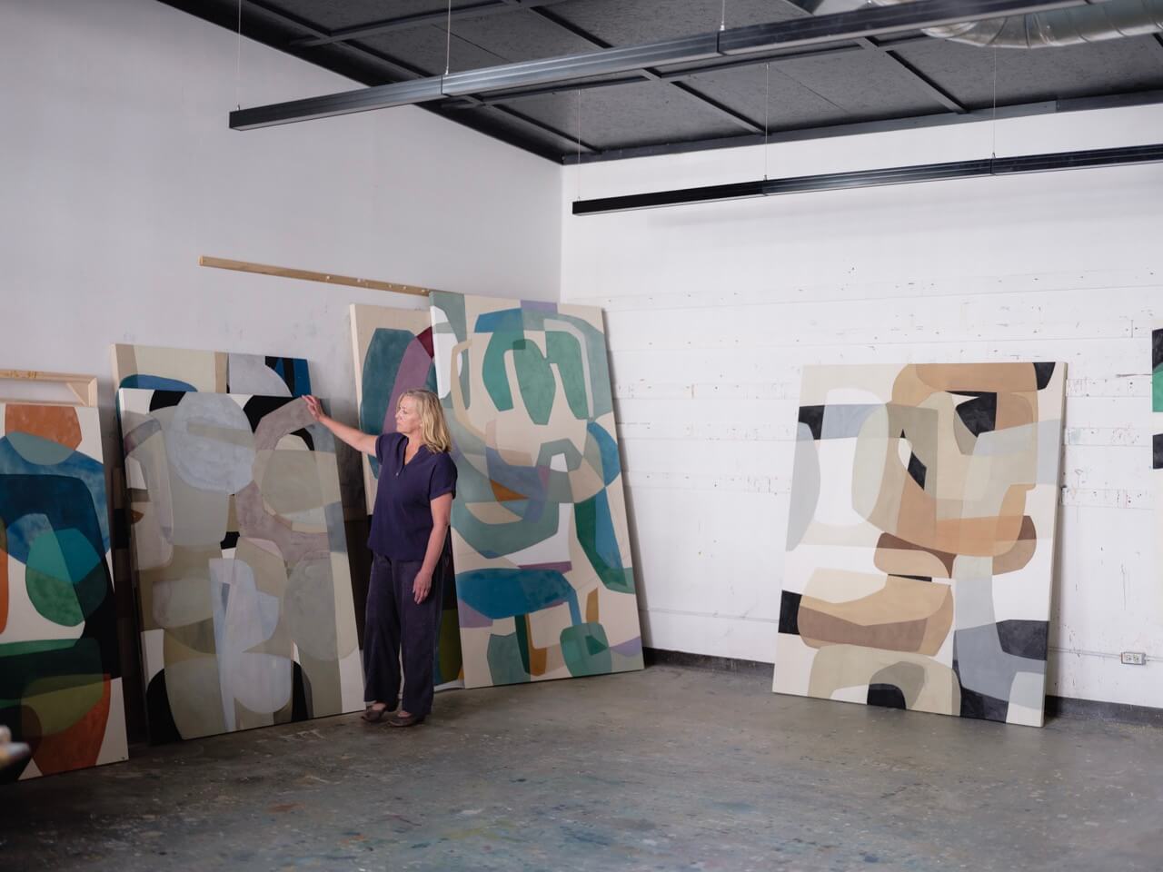
She came to all of this sideways. Through watercolor societies and weekend workshops. Through a gallery that burned. Through a studio bought with insurance money on a street where old men still walked in occasionally, looking for auto parts, quietly disappointed.
She did not set out to build a design philosophy. She built it because the paintings kept failing until she did. Because she kept asking — in the watercolor years, in the early acrylic years, in the years before the studio, when she was painting at a kitchen table with three children four and under — why this is not working. What is not holding. What the bones are doing wrong.
The answer was almost always the same. Not a color problem. A design problem. A decision that had not been made, a corner that had not been considered, a shape that was the easiest answer rather than the right one.
The work, once you understand this, becomes a different kind of problem. Not how do I make something beautiful, but how do I make something that is built to hold. The color, when it comes, will take care of itself.
Wendy Westlake’s course, Color and Composition, is available now on Arteway. It is the first time she has broken her complete process into a structured, teachable form — from the first design decision to the last considered mark on raw canvas.
